Categories
Florida Tampa Bay

Tampa’s OpenHack Ybor meetup: Tonight at Brass Tap!

openhack ybor - new world

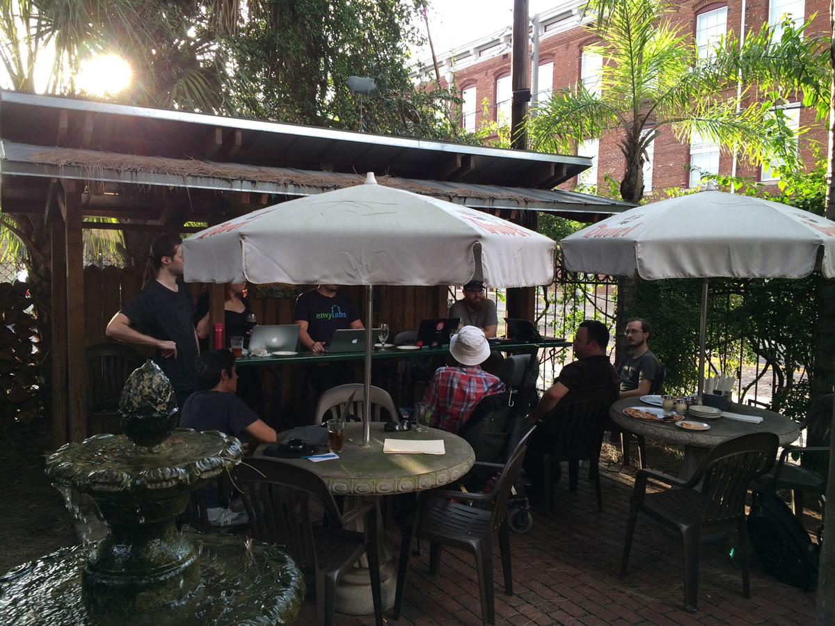
OpenHack Ybor’s August gathering at New World Brewery.
Click the photo to see it at full size.

If you’re in the Tampa area tonight and would like to get to know your fellow developers, show off your current passion project, find out what their passion projects are, and enjoy some pizza and beer (or whatever beverage you like) in a friendly, convivial atmosphere, you might want to come to tonight’s OpenHack Ybor meetup!

openhack ybor - new world 2

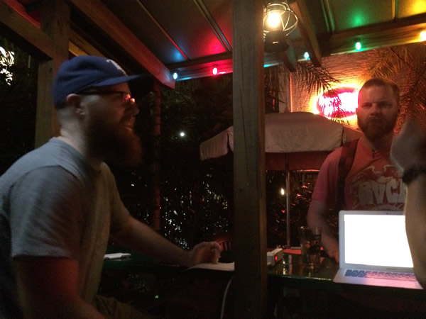
Another scene from the meetup at New World Brewery.

OpenHack Ybor, held once a month at one of Ybor City’s many beer-dispensing hangouts, is run by local Ruby developer Tony Winn for software developers of all stripes who want to get to know other local developers, see what they’re up to, and enjoy some free pizza. We’ve already had two OpenHack Ybor meetups — the first at the new pub at Coppertail Brewing, and the second at New World Brewery. Tonight’s meetup, which starts at 6:30, takes place at the Brass Tap in Centro Ybor.

centro ybor

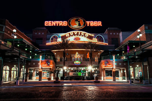
Tonight’s meetup location: Brass Tap in Centro Ybor.

If you’d like to attend, RSVP on OpenHack Ybor’s meetup page (there’s no admission, the pizza is free, you’ll have to buy your own beer) so that Tony’s got an idea of how many will be there and can order pizza accordingly. It’s fun, it’s friendly, and it’s one of my go-to geek events. I’ll be there, and I hope to see you there too!

The article also appears in my personal blog, The Adventures of Accordion Guy in the 21st Century.

Categories
Uncategorized

Google’s new logo

Google announced today that they have a new logo:

new google logo

This is the first really noticeable change to Google’s logo since 1999. There were a couple of tweaks in 2010 and 2013, but unless you’re into design, chances are that you didn’t notice. The transition from the original serif font, which has been less embossed over time, to this new, simpler, sans-serif typeface will be obvious even to non-designers. I suppose we were given a hint when Alphabet was announced — the new font is the same as the one on the alphabet blocks on that page:

alphabet blocks

According to their announcement on the Official Google Blog, the new look is meant to reflect Google’s ubiquity across all manner of computing devices — “whether it’s on your mobile phone, TV, watch, the dashboard in your car, and yes, even a desktop!” It also fits the “bold, graphic, intentional” look and feel that they’ve been going for since they unveiled Material Design.

In addition to a full-on wordmark, there’s this icon, which incorporates its four colors into a single “G”:

google icon

Here’s their video announcing the new logo:

And if you’re a serious design nerd, you’ll want to check out “Evolving the Google Identity” on Google’s design blog. (And yes, my first question was “Wait…Google has a design blog?”)