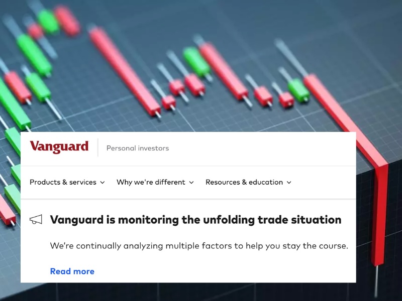
If you go to Vanguard’s Personal Investors login page, you’ll see the message above. It’s oddly reassuring that there’s a warning that essentially says “You can log in, but you’re not going to like what you see when you do.”
If you go to Vanguard’s Personal Investors login page, you’ll see the message above. It’s oddly reassuring that there’s a warning that essentially says “You can log in, but you’re not going to like what you see when you do.”
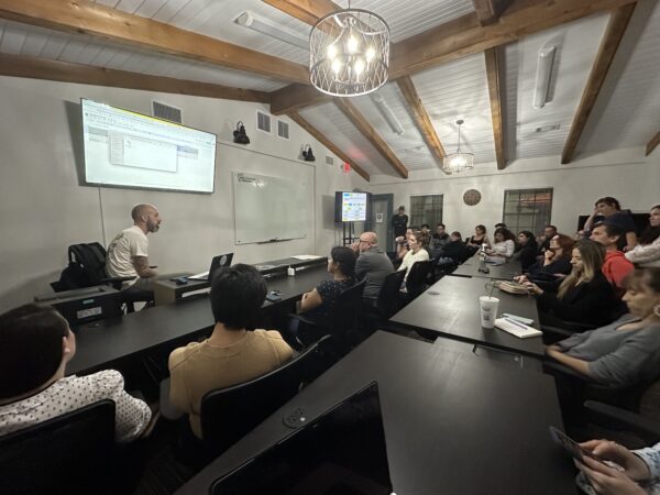
It was a packed house at Computer Coach last Thursday when the Tampa Bay User Experience meetup group gathered for Phil Doughty’s presentation, The ROI of UX.

Here’s the abstract for the event:
Are you trying to start or build a UX practice in your organization? Have you run into a brick wall when trying to get support? Are you constantly trying to “sell” UX to your executive team? Nothing speaks louder than being able to show a return on investment (ROI). In this edition from our UX Fundamentals series, Phil Doughty will show us how we can put UX into terms that make sense to the C-suite; dollars and cents.
For about an hour, Phil, a Customer Success Manager at UserTesting, led the group through his presentation showing how to speak the language of stakeholders in order to convince them of the necessity and value of UX in software and services. He was assisted by his coworker Christian Knebel (also a Customer Success Manager), who teleconferenced in from Dallas.
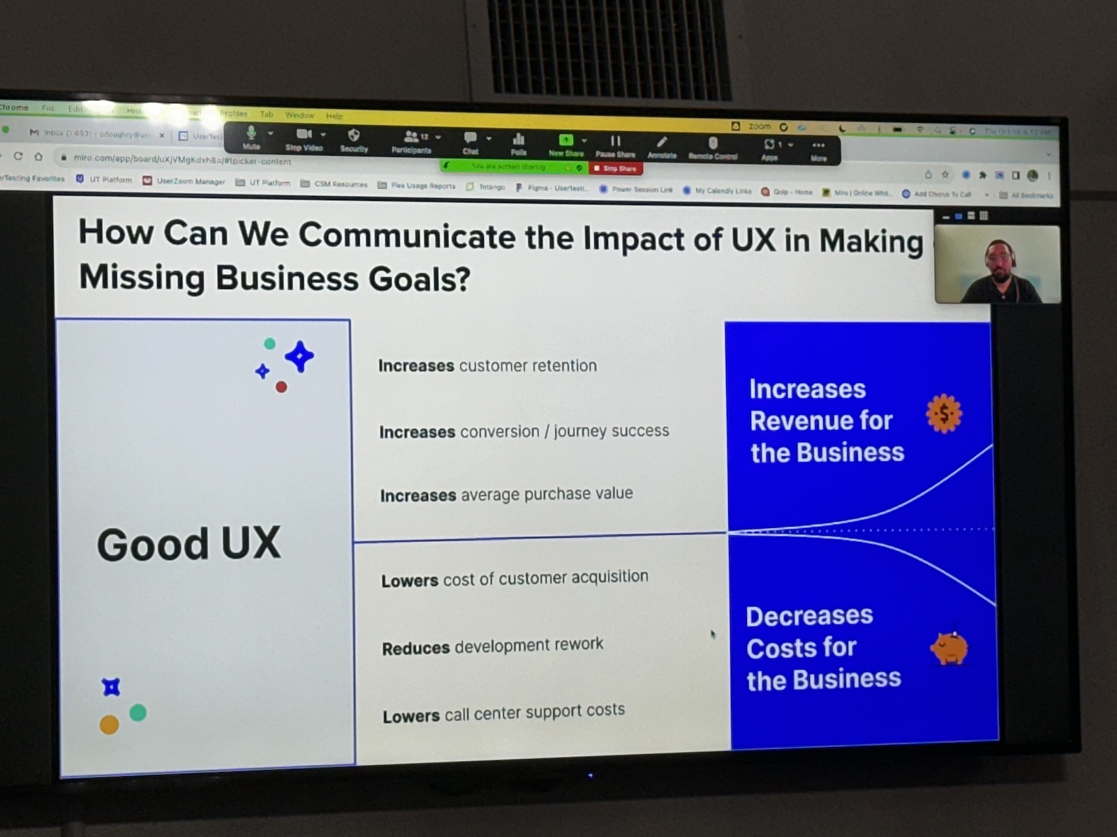
In the end, Phil argues, you have to account for stakeholder needs. When talking to the C-suite, that often boils down to dollars and cents. You need to convince them that good UX either…
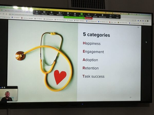
Phil spent a fair bit of time on Google’s HEART framework. It’s a powerful tool tailored for UX teams, empowering them to prioritize and enhance distinct facets of the user experience, while also enabling the establishment of clear objectives and user experience metrics to measure their achievements.
HEART, as the acronym suggests, is made up of five key elements, each representing a different aspect of user experience measurement:
HEART’s five elements collectively provide a comprehensive framework for evaluating and improving the user experience of a digital product or service. You can apply them to a single feature in your software or service — or ideally, to the whole thing.
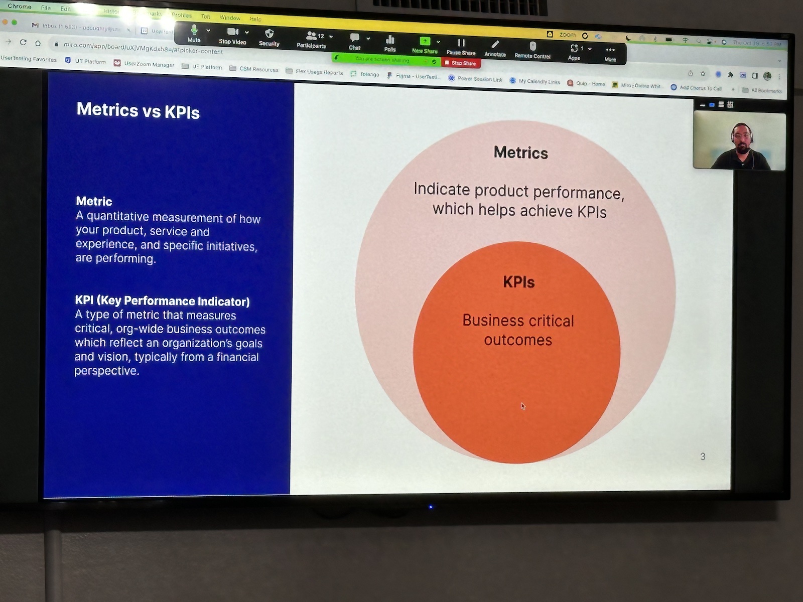
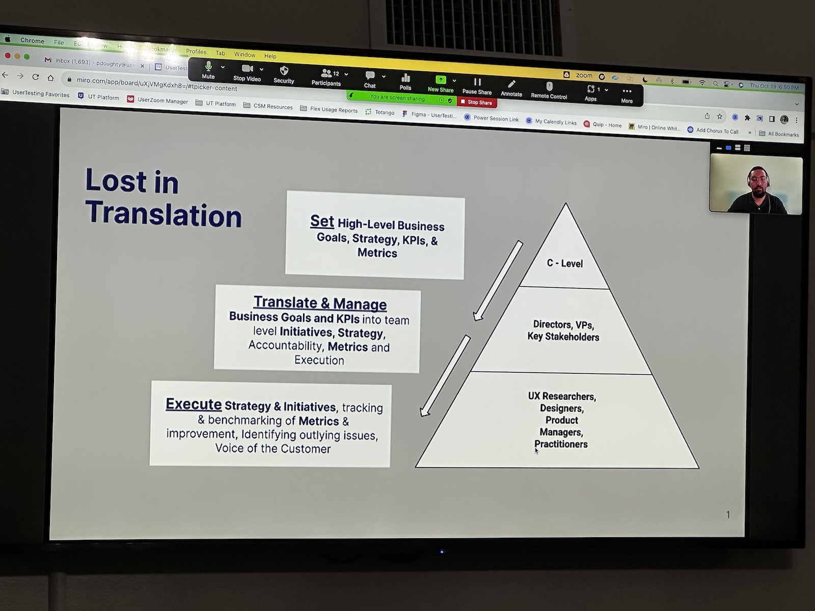
If there was one slide that everyone should have taken a picture of, it’s the one above — Metrics vs. KPIs. This makes it clear:
For example, an ecommerce site’s conversion rate — the percentage of website visitors who take a specific action, such as making a purchase — would be a metric, but it wouldn’t be a KPI.
However, that site’s monthly revenue growth — the increase in revenue from one month to the next — is a metric that also qualifies as a KPI. It’s a KPI because it reflects the site’s core business objective: to increase revenue over time.
Typically, a free meetup will get half the people who registered to actually show up, but this one was different — we had a packed room, and it appeared that at least two thirds of the registrants were there! It looks like the result of interesting presentations and an involved, active tech scene.
The Tampa Bay User Experience group has these upcoming events:
I arrived a little late, after doing a startup mentoring session at University of Tampa’s Lowth Entrepreneurship Center (pictured below):

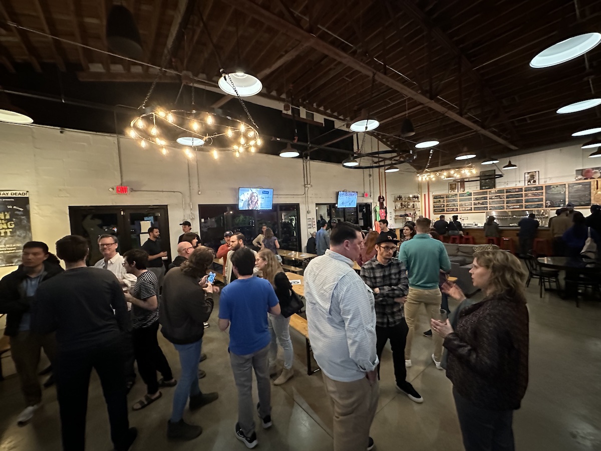
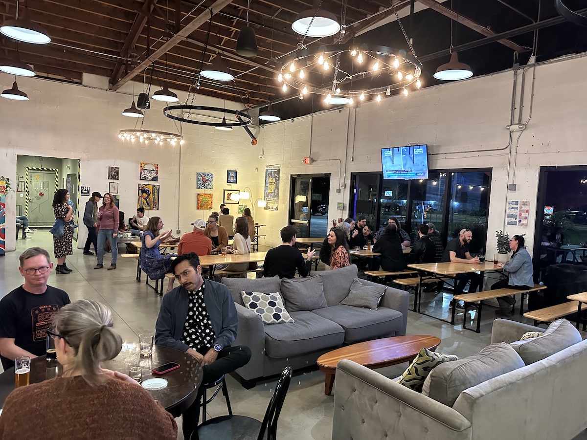
Luckily, it was a quick drive from downtown to the Tampa Bay UX Group Revival Social’s venue, which also happens to be one of my “locals”: 7venth Sun Brewery’s Seminole Heights branch, a great space for large social gatherings:
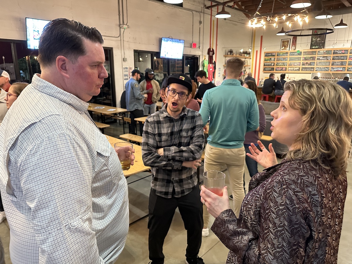
It was good catching up with people I haven’t seen in a while, including Micah Overton, whom I worked with during my time at Lilypad:
More than 40 people RSVP’d for the get-together, and the “flake-out” factor was low. It’s not unusual for only half the RSVPs to show up at a meetup that doesn’t charge admission, but it looks like the number of actual attendees was pretty close to the RSVP count. The Tampa Bay techie scene isn’t just active, but it’s also eager to get together!

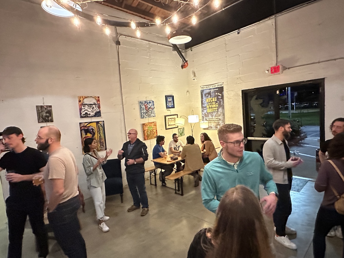
The event ran from 6:30 to 8:30, but a fair number of the crowd stayed later:
My thanks to organizer Rob Vanasco for putting on a great event and brining back one of Tampa Bay’s key meetups! I got to chat with him briefly, and he said that this is only the start of Tampa Bay UX Group meetups for 2023. Keep an eye on their Meetup page!
I’d also like to thank 7venth Sun Brewery in Seminole Heights for continuing to be an excellent venue for meetups. In case you’re curious, here’s last night’s beer menu:

If you design or develop front ends, whether web, mobile, or even desktop, you really should watch the latest Web Briefs video by Heydon Pickering, What happened to text inputs?
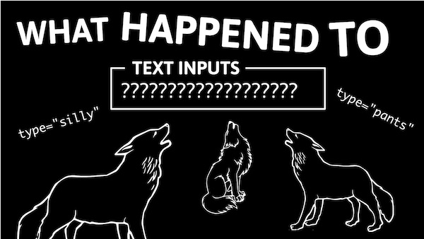
The video starts with a twist on the classic parable, Inside you are two wolves. In this twist, one of the wolves is called “Adrian”…
…and the other’s called “Chris”:
The video covers its topic very well, and very amusingly — stop messing with text input boxes and making them less usable! They should very clearly indicate that:
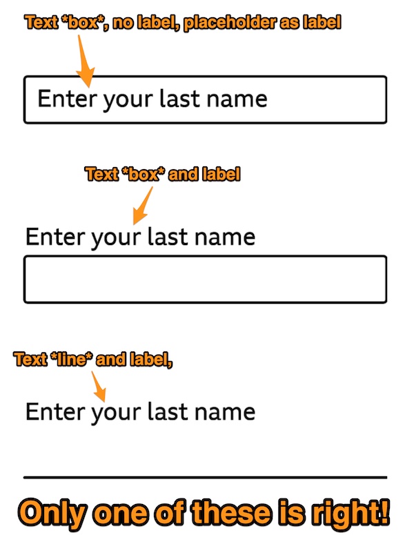
The video also goes into topic such as why using text input value placeholders are a poor substitute for labels, as well as why the latest slew of aesthetic tricks are still worse than using a good ol’ text box and label.
I found this via Maria Lambert Bridge, the CCO for the Center for Human Technology. She writes:
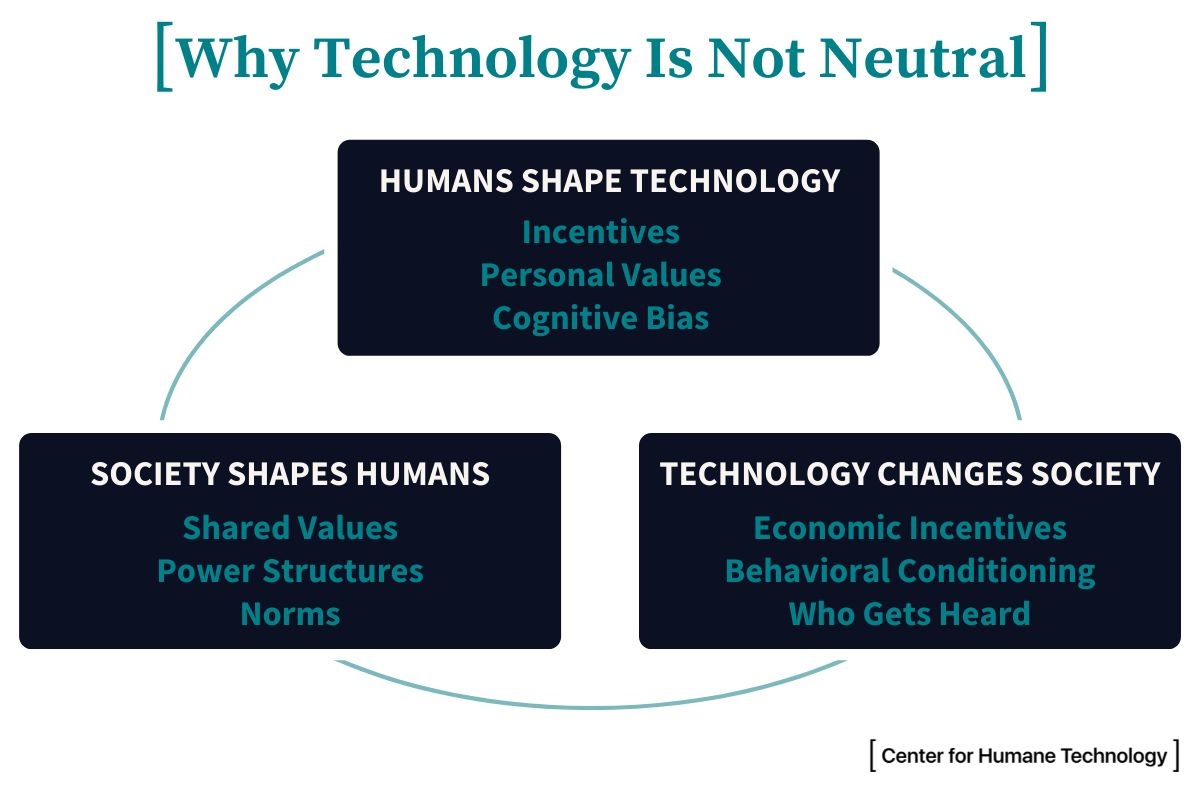
Tech isn’t just a passive tool. Tech shapes us, and we shape technology.
Every design choice has an implication.
Every interaction has an effect.
Tap the image to see it at full size.
I recently made the mistake of not double-checking my UIs in light mode and dark mode, which left the checklist app in the book I co-wrote unusable in dark mode:
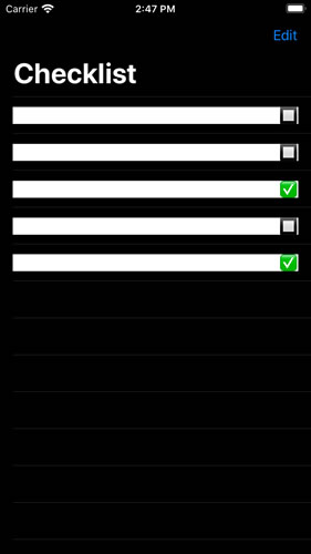
I’d set the text color to the system default text color, which becomes white in dark mode. I also set the background color for rows to white, but forgot to account for dark mode, resulting in this white-text-on-white-background mess. The fix was simple: set the background color of the rows to the system default background color, which adjusts automatically for the current mode.
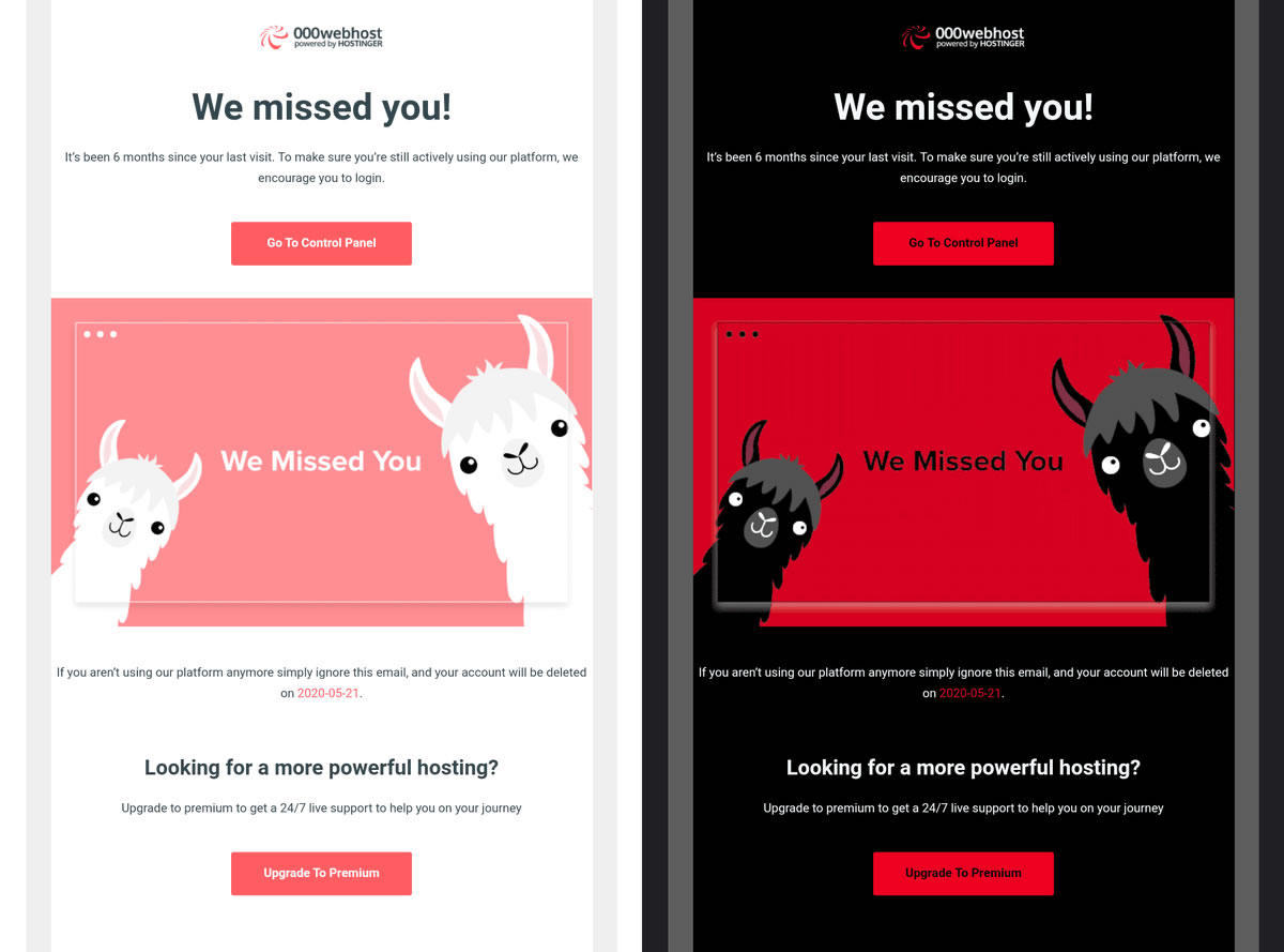
My mistake didn’t produce results as demonically hilarious as the “We missed you!” message from a web hosting service. In light mode, you were greeted by this fluffy llama…

…but dark mode turned the llamas into something completely different (but oh so very METAL):

This observation was made by Rémi Parmentier:
Faites confiance au mode sombre de Gmail pour transformer un « Oh ils sont trop mignons les petits lamas » en « OH MON DIEU NOUS SOMMES EN ENFER QU’EST-CE QU’ILS ME VEULENT ». https://t.co/ZVweRiYVe6 (via @Sayo1337) pic.twitter.com/iJ4kwZtt22
— HTeuMeuLeu (@HTeuMeuLeu) May 11, 2020
It translates as: “Trust Gmail’s dark mode of Gmail to transform an ‘Oh, such cute little llamas’ into ‘OH MY GOD WE ARE IN HELL WHAT THEY WANT FROM ME’”.