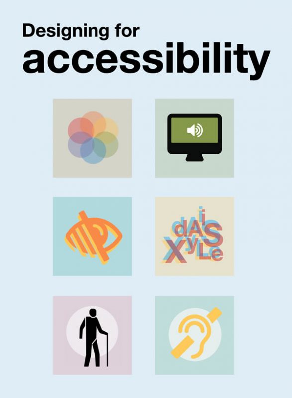
If you’re designing applications with user interfaces, you might want to check out these posters from the UK Home Office on Dos and don’ts on designing for accessibility. These posters were designed by Karwai Pun, who works with an accessibility group at Home Office Digital to make existing and new services better for the Home Office’s users. She created these “dos and don’ts” posters as a way of approaching accessibility from a design perspective.
These posters cover designing for users with various needs:
- Designing for users on the autistic spectrum
- Designing for users of screen readers
- Designing for users who are deaf or hard of hearing
- Designing for users with physical or motor disabilities
- Designing for users with low vision
- Designing for users with dyslexia
- Designing for users with anxiety
To find out more, see the UK Home Office’s Dos and don’ts on designing for accessibility page.
Designing for users on the autistic spectrum
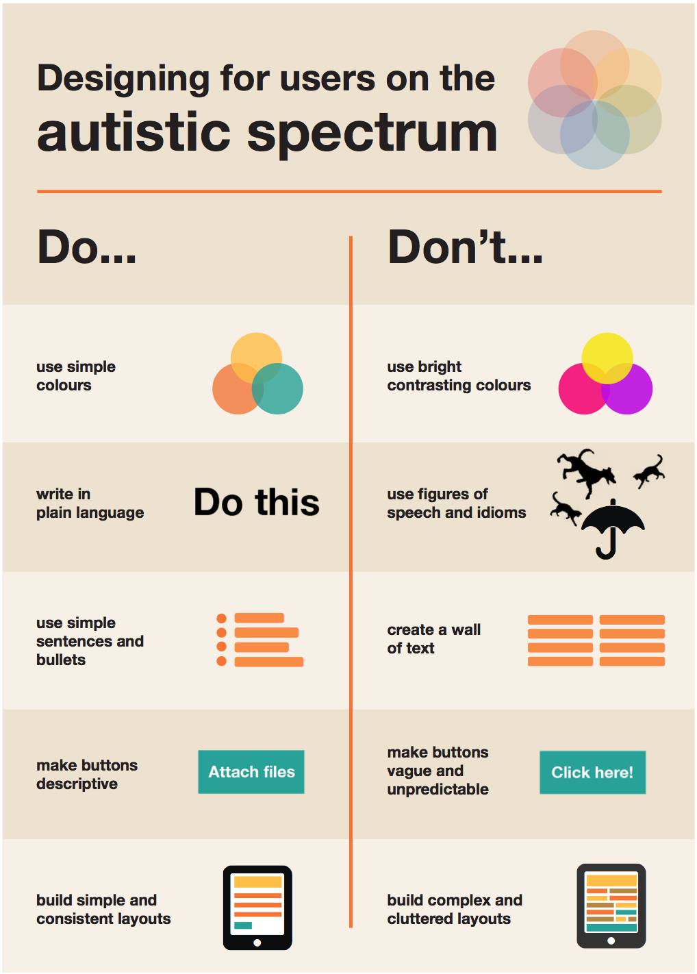
- Use simple colors. Don’t use bright contrasting colors.
- Write in plain language. Don’t use figures of speech and idioms.
- Use simple sentences and bullets. Don’t create a wall of text.
- Make buttons descriptive. Don’t make buttons vague and unpredictable.
- Build simple and consistent layouts. Don’t build complex and cluttered layouts.
Designing for users of screen readers
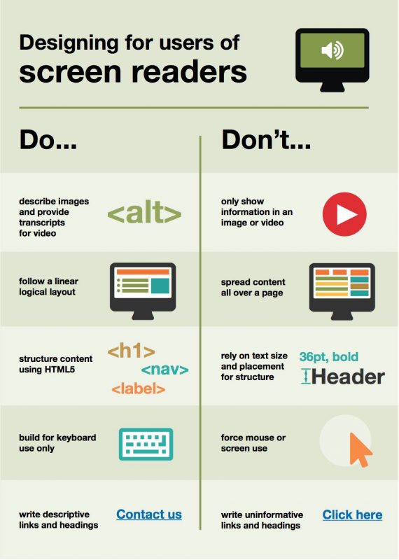
- Describe images and provide transcripts for video. Don’t only show information in an image or video.
- Follow a linear logical layout. Don’t spread content all over a page.
- Structure content using HTML5. Don’t rely on text size and placement for structure.
- Build for keyboard use only. Don’t force mouse or screen use.
- Write descriptive links and headings. Don’t write uninformative links and headings.
Designing for users who are deaf or hard of hearing
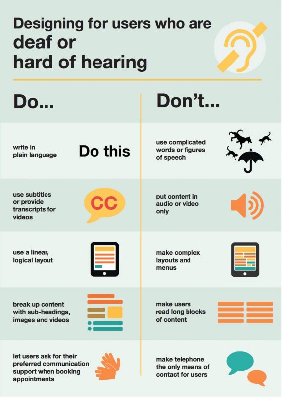
- Write in plain language. Don’t use complicated words or figures of speech.
- Use subtitles or provide transcripts for videos. Don’t put content in audio or video only.
- Use a linear, logical layout. Don’t make complex layouts and menus.
- Break up content with sub-headings, images, and videos. Don’t make users read long blocks of text.
- Let users ask for preferred communication support when booking appointments. Don’t make telephone the only means of contact for users.
Designing for users with physical or motor disabilities
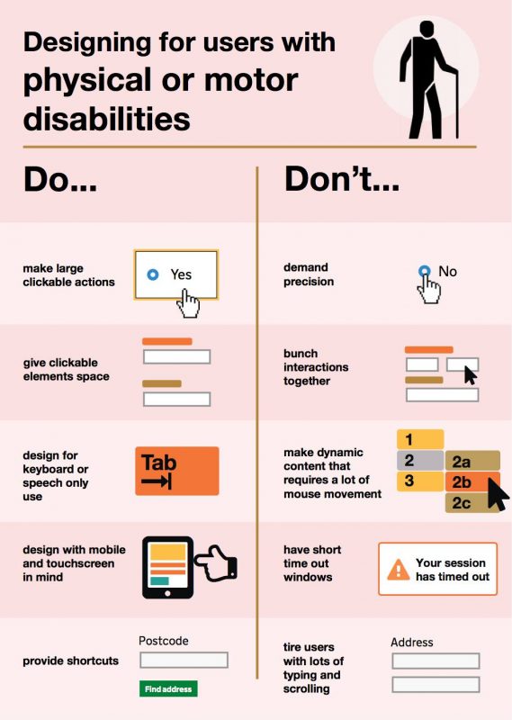
- Make large clickable actions. Don’t demand precision.
- Give clickable elements space. Don’t bunch interactions together.
- Design for keyboard or speech only use. Don’t make dynamic content that requires a lot of mouse movement.
- Design with mobile and touchscreen in mind. Don’t have short time-out windows.
- Provide shortcuts. Don’t tire users with lots of typing and scrolling.
Designing for users with low vision
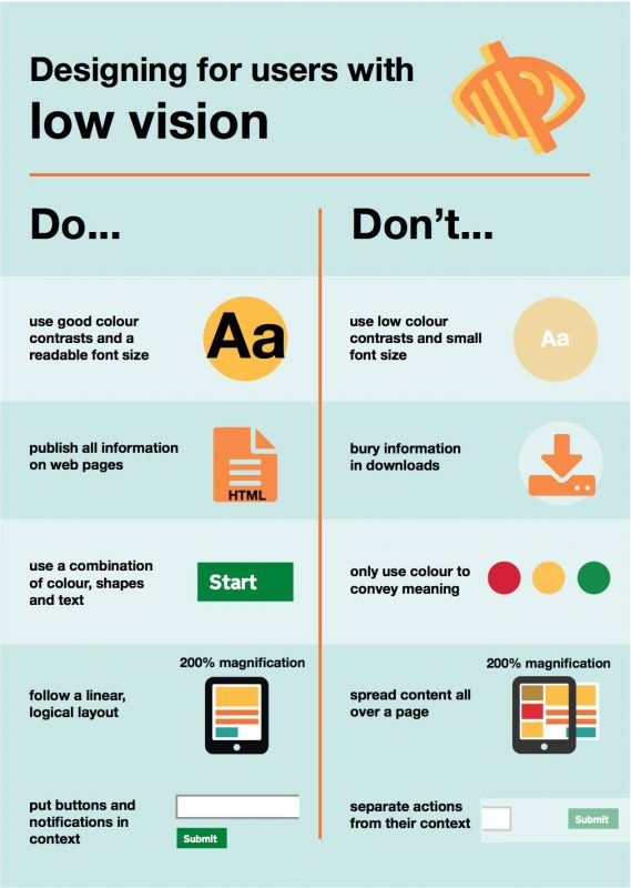
- Use good color contrasts and a readable font size. Don’t use low color contrasts and small font size.
- Publish all information on web pages. Don’t bury information in downloads.
- Use a combination of color, shapes, and text. Don’t only use color to convey meaning.
- Follow a linear, logical layout. Don’t spread content all over a page.
- Put buttons and notifications in context. Don’t separate actions from their context.
Designing for users with dyslexia
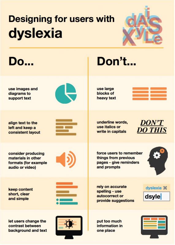
- Use images and diagrams to support text. Don’t use large blocks of heavy text.
- Align text to the left and keep a consistent layout. Don’t underline words, use italics, or write in capitals.
- Consider producing materials in other formats (for example, audio or video). Don’t force users to remember things from previous pages — give reminders and prompts.
- Keep content short, clear, and simple. Don’t rely on accurate spelling — use autocorrect or provide suggestions.
- Let users change the contrast between background and text. Don’t put too much information in one place.
Designing for users with anxiety
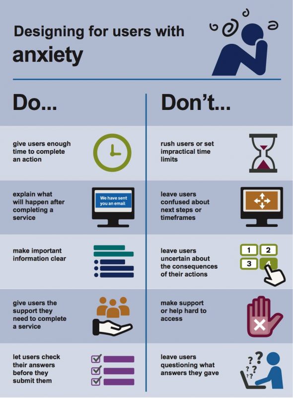
- Give users enough time to complete an action. Don’t rush users or set impractical time limits.
- Explain what will happen after completing a service. Don’t leave users confused about next steps or timeframes.
- Make important information clear. Don’t leave users uncertain about the consequences of their actions.
- Give users the support they need to complete a service. Don’t make support of help hard to access.
- Let users check their answers before they submit them. Don’t leave users questioning what answers they gave.
Found via Ramon Grajo.
4 replies on “The UK Home Office’s posters on designing for accessibility”
Thankyou. From a trade teacher in Australia. :)
[…] Par Home Office Digital […]
I appreciate you having all the posters, including the new one on Anxiety!! I use these all the time and hope I am making a small difference in the world!
[…] Fuente: Home Office Digital Como dicen los diseñadores de Microsoft: « Diseñar de manera inclusiva no significa que hagas una cosa para todos. Diseñas una variedad de formas para que todos participen en una experiencia con sentido de pertenencia. » […]