Google announced today that they have a new logo:
![]()
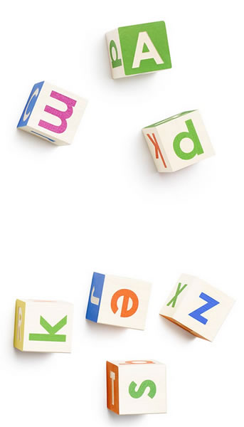
This is the first really noticeable change to Google’s logo since 1999. There were a couple of tweaks in 2010 and 2013, but unless you’re into design, chances are that you didn’t notice. The transition from the original serif font, which has been less embossed over time, to this new, simpler, sans-serif typeface will be obvious even to non-designers. I suppose we were given a hint when Alphabet was announced — the new font is the same as the one on the alphabet blocks on that page:
According to their announcement on the Official Google Blog, the new look is meant to reflect Google’s ubiquity across all manner of computing devices — “whether it’s on your mobile phone, TV, watch, the dashboard in your car, and yes, even a desktop!” It also fits the “bold, graphic, intentional” look and feel that they’ve been going for since they unveiled Material Design.
In addition to a full-on wordmark, there’s this icon, which incorporates its four colors into a single “G”:
![]()
Here’s their video announcing the new logo:
And if you’re a serious design nerd, you’ll want to check out “Evolving the Google Identity” on Google’s design blog. (And yes, my first question was “Wait…Google has a design blog?”)