
Here are my notes on the presentation Search Behaviour: A Tour of the Golden Triangle presented by Enquiro Research’s Gord Hotchkiss as part of the Search User Behaviour panel at Search Engine Strategies 2008 Toronto.

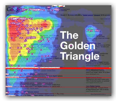
The Golden Triangle refers to that upper left-hand corner of a search engine results page where the reader’s eye spends most of its time. The phrase was coined by the search engine marketing firm Enquiro Research based on the results of their 2005 eye-tracking study, in which they tracked the eye movements of readers of Google results pages.
The Area of Greatest Promise
Why is the first listing seen so important? Because it’s in the Area of Greatest Promise. That’s the upper left-hand corner of the page. We found that the average time that users spend on a search results page is about 10 to 12 seconds. During the first 2 seconds of that time — or basically 20% of the time people spend on a search page — users’ eyes are mostly focused on the Area of Greatest Promise.
We ran a test: we took a Microsoft search results page and changed one thing: the sponsored link at the top of the page — in other words, an advertisement in the Area of Greatest Promise. In some cases we showed an ad that was highly relevant to the search, in others, we showed a non-relevant ad. We then asked our test subjects:
- if they would use the search engine for a similar query
- if they would use the search engine for other queries
- if they would recommend the search engine to a friend
- if they would make the search engine their preferred one
Here’s a photograph of a chart showing the results that shows test subjects who were shown relevant and non-relevant ads in the Area of Greatest Promise:

For every question, the test subjects who were shown relevant ads in the Area of Greatest Promise answered “yes”. The lesson is that the quality and relevance of that top ad in a search engine results page is critical.
Why do We Scan Search Results in Groups of 3 or 4?
When you look at the hot spots in our eye tracking “heat maps”, you’ll see that the first 3 or 4 items are scanned, and subsequent results are also scanned in groups of three or four. That’s because of the way our brains our wired. Human memory isn’t stored in a convenient clumps, but instead each memory is broken into fragments and stored in different parts of the brain, depending on the context. When we retrieve a memory, these fragments are reassembled on a “bench” which we call working memory or executive function. Channel capacity — that is, capacity of working memory — is limited to “seven, plus or minus two” items.
We see this all the time in purchasing behaviour. When you think of laptop for purchase, you typically consider 3 or 4 brands. We take shortcuts when thinking of something, cutting things down into graspable chunks. This approach is sometimes called satisficing. Search engines give us a playground to satisfice, and it all happens in the Golden Triangle.
Why is branding so important?
Although we want to narrow things down to as few selections as possible when making a purchase, we feel that a result set is more useful when there are alternatives presented. In an experiment where we presented test subjects looking for Brand A in search results pages with:
- Brand A as both the top organic and sponsored result
- Brand A as the top organic result, Brand B as the top sponsored result
- Brand A as the top organic result, Brands A and B as the top sponsored results
…the test subjects recalled, purchased and clicked more when presented with more brands in the PPC area of the page.
Another strange thing we noticed while doing eye tracking on searches for laptops. We kept seeing “bounces”, where our test subjects’ eyes kept moving away from the Golden Triangle and over to the right sidebar of the search results page where the advertising was. This would happen about 2 or 3 seconds into their scanning the page. We found out that it was because Dell wasn’t a brand returned in the top set of our tests — they were looking for Dell in the sidebar.

This led us to do more research and we ended up finding that there is a 16% “lift” in brand association when your brand is in both the top organic and sponsored results.

How Rogers Missed the Boat on the iPhone Announcement
Rogers recently announced that they were going to the be exclusive iPhone carrier in Canada. We know there was a lot of interest in this development because Google queries in Canada for the search term “iPhone” tripled. If you looked at the Google search results page for “iPhone” on the day Rogers made the announcement, you’d have seen this:

Rogers is nowhere to be seen on the Google results page — not in the organic results, and not in the PPC results. But you know who bought an ad? BlackBerry. Rogers’ heads are up their asses.
“Canada is so far behind in search, it’s embarrassing.”
One reply on “Notes on “The Golden Triangle” from Search Engine Strategies 2008 Toronto”
[…] on. Having your dealer website show up organically at the top of the listings within the Golden Triangle, followed by additional content from social media, such as a YouTube video of your latest […]