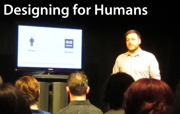
I started the day at the Social Media Breakfast Ottawa (Shopify’s home city), a regular event where local people interested in all things social media gather to meet their peers, see presentations and get to know each other. As the new kid in town (I’m in Ottawa for the summer to immerse myself in Shopify, after which I’m going to working from my home city of Toronto), I made it a point of catching this event to get to know the local tech, design and business scene.
The other reason I wanted to attend the session was the presentation, Designing for Humans, which was given by Martin Gomez. Gomez works on both sides of the U.S./Canada border: he’s a professor of design at Algonquin College here in Ottawa, but he’s also Creative Director at Sparkart, which is in San Francisco.
His talk was a good introduction to user-centred design and perfect for the majority of the audience. A lot of us weren’t from a design background — we were from either the tech or business side, and it’s important to have an understanding of what design is. To borrow a quote from Steve Jobs, who really sweats the design details in his products, “It’s not just what it looks like and feels like. Design is how it works.“
As is my habit, I took notes during the session, and I’m sharing them below. Enjoy!
My Notes
- What is a user interface?
- It’s how a human “speaks” to a machine, and how the machine responds.
- When we think of user interfaces, we think of buttons and displays, but there’s more to user interfaces than that.
- On a phone, the user interface isn’t just the buttons, but the way the handset is shaped, and even (on a desktop phone) how the cradle holds the handset.
- Consider the Ferrari:

- Even though none of us drive a Ferrari, we’d know how to do so if we had the chance — at least those of us who drive stick, anyway, and there are Ferraris with automatic transmission.
- The first thing we’d do is look for the ignition, and we’d probably be looking to the right of the steering wheel, with the keys in our right hand.
- Why would we know how to drive a Ferrari even though we’ve never driven one before? Why would be searching for the ignition to the right of the steering wheel?
- It’s because of conventions.
- Conventions are important!
- Oftentimes, the best way to do something is to do it the way it’s always been done.
- I often have to fight with students about this; being young, they’re always trying to change everything for change’s sake.
- There may be cooler ways to do something, but are they usable?
- Let’s consider remote controls for TVs. Here’s the Zenith Space Commander:

- It’s nice and simple!
- Now consider the present-day cable TV remote:
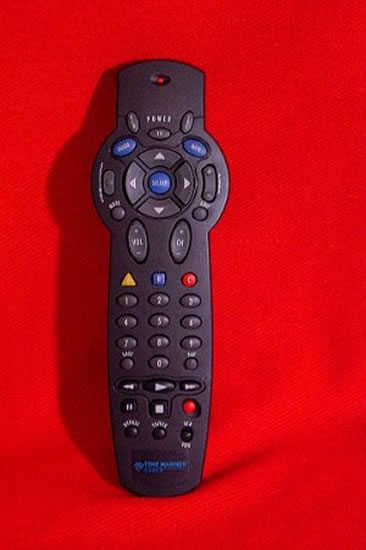
- We’re all used to this style of controller now, even though we may have had to explain it to our parents.
- Note the buttons: five different colours, a number of different shapes, a couple of different up/down controls.
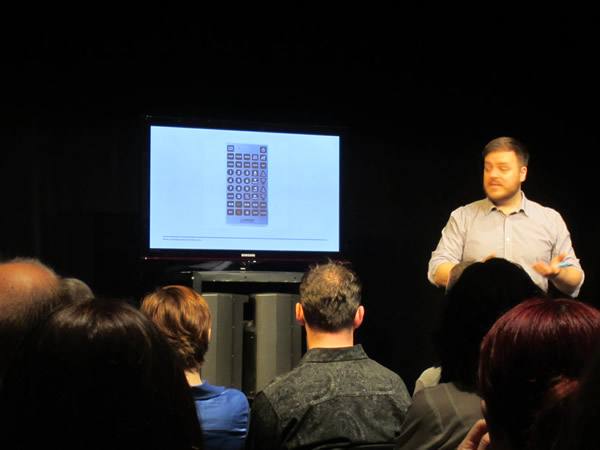
- Let’s take a look at one more kind of remote: the novelty oversized remote, which is big enough that you almost need two hands to hold it:

- This is a disaster — you have to look at it in order to be able to operate it.

- On the other hand, there’s a lot of good stuff going on with the standard cable TV remote:
- It fits easily in your hand.
- When you’re holding it at its most balanced point, the most often-used controls are easiest to reach.
- Differently-shaped buttons let you navigate by feel.
- Functions that feel similar (such as channel up/down and volume up/down) are kept in separate places to avoid confusion.
- You can operate this remote without having to look at it — after all, you’re looking at the TV!
- Let’s look at an old videogame controller — this is from the ColecoVision system:

- That thing at the top of the controller is a joystick, which moved only a millimetre in any direction.
- Just below it and to the side of the controller were two buttons.
- Below the buttons was the keypad, which didn’t seem to be used for anything.
- As complex as that control was, Coleco came up with an even more complex one for games like baseball:
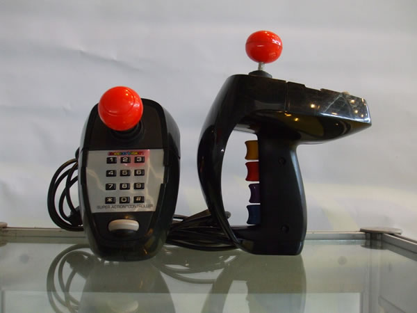
- This was a really complex controller!
- On its top was a joystick, keypad and left/right scroll wheel.
- Inside the “pistol grip” were four “trigger” style buttons.
- You had lots of input options, but it was all very complex.
- Then came this:

- Compared to Coleco’s complex controller, the Nintendo controller was a joke.
- However, game developers discovered that you could get a lot out of simple controls.
- Today’s game controllers are still based on Nintendo’s layout.
- Presenting the user with fewer options means less thinking and more enjoyment.
- How do we make user interfaces better?

- This is the AlphaGrip keyboard.
- What if I told you that you could easily be typing 50 words per minute on it?
- What if I told you that this was coming standard with all iMacs — all polished up and silver, of course — and replacing the standard keyboard?
- Most of you wouldn’t go for it. (There’s always one who will, but most of you wouldn’t.)
- Why is this so? Because of the perceived effort in learning how to use this strange keyboard.
- There’s also the matter of people reacting with: “Why should I bother learning this one? My keyboard’s fine.”
- For most people, there just doesn’t seem to be enough to be gained from this keyboard for it to be worth learning.
- In the meantime, the QWERTY keyboard we all know and love is intentionally designed to slow us down.
- This keyboard layout is from the days of mechanical typewriters, which jammed if you typed too quickly, so the most commonly-used letters were moved out of the way.
- Old MP3 players seem so quaint now:

- Their design followed the convention of a familiar device: CD players.
- The along came an MP3 player that completely broke the convention:
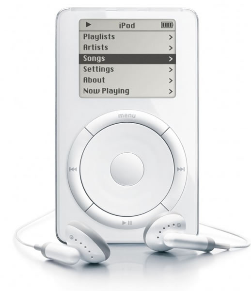
- Instead of the CD player-style interface where the controls were all buttons, the iPod’s interface was centred around the wheel.
- “Your thumb hit the wheel, and it was a sensual experience!”
- “The button pushes back like it loves you.”
- Now, if you look at present-day media players, the iPod is the convention.
- So yes, there is a time to break conventions and innovate.
- With innovation, the new design must be so intuitive that we immediately forget the convention.
- How do we use these principles to make a great website?

- When I went online to try and buy speakers, I didn’t look at the site thoroughly and then go “Hmmm…what to click?”
- The site’s very cluttered. I got lost a couple of times, and ended up clicking on something that was easy to find, even though the closest to ideal speakers were right in front of me.
- Users don’t look at a site, evaluate it and then pick the optimal option; instead, the pick the first satisfactory one.
- This act is called “satisficing”, which comes from the words “satisfy” and “suffice”.
- Satisficing isn’t always an act of laziness. Firemen do it too, when rushing into a burning building — there isn’t time to figure out what the optimal option is.

- On the other hand, his favourite book store site, Amazon is easy to use.
- Steve “Don’t Make Me Think” Krug raves about it.
- On the Amazon site, all clickable things are blue, and things meant to call out your attention are orange.
- It makes good use of layout, taking advantage of negative space.
- It’s also quite readable, because it’s been built based on the “F formation”, and F-shaped pattern that our eyes follow when reading online.
- The F formation was observed when performing eye tracking on people reading websites:

- Notice that the “hot” part — where the reader’s eyes spend the most time — is near the top.
- Good web designers put the most important stuff on the top because that’s where the eyes go.
- Take a look at the Skype site:

- Skype is a pretty complex product, but the site’s design is quite simple.
- The design suggests that it’s not difficult to learn how to use Skype.
- Many complex products have simple sites.
- Another example: MailChimp!

- MailChimp is about running email newsletters and campaigns, which isn’t simple, especially for large lists.
- “But look at that monkey! It makes you think you’re going to have the time of your life using MailChimp!”
- When learning something new, there’s associated stress; having a cute mascot lowers that level of stress and diminishes the expectation that learning MailChimp is going to be difficult.
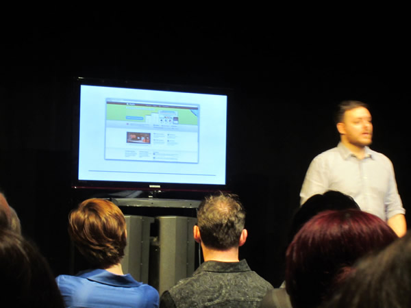
- Yet another example: Shopify!
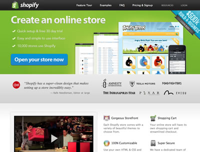
- Making online stores is a very complex thing.
- There used to be a time when if a client asked me if I could build them a store, I’d say “Hell no!”
- Shopify makes the process very easy, and the site design reflects that.
- The user interface of Shopify is great — the sign-up process is very nice, showing you what the next steps are.

- Put yourself in the user’s shoes and remember these things that all users ask of a site:
- Don’t make me think.
- Don’t waste my time.
- Show me what to do.
- “Don’t reinvent the wheel unless you’ve got a better wheel!”
One reply on “Designing for Humans (Notes from the Ottawa Social Media Breakfast)”
That thing about the QWERTY keyboard may not be entirely accurate; see, for example:
http://www.economist.com/node/196071