Here’s part two of my notes from the 2-hour talk that npm COO Laurie Voss gave at Tampa Bay Startup Week, Stuff Everybody Knows (except you). Regular readers of this blog will know that when I take notes, I really take notes.
In case you missed part one, it’s here.
What is coding?

- Now that you’ve gotten good at the basics, it’s time to do your job: actual web development.
- Coding is:
- 50% solving the problem
- 50% communication — that means listening to the person whose problem you’re trying to solve.
- You have to understand the broader context of and the constraints under which you’re operating.
- You have to recognize priorities.
- Solving in the abstract solves a problem that you’ve invented in your head, but not the problem that you’re being paid to solve.
- Understanding the problem is crucial to being a web developer, as is communicating back your solution.
- Once you written the code, you should be able to explain what it does, what it doesn’t do, where the bugs are, how it’s documented, how to test it.
- If you write code that only you understand, you are its only user, and that’s of no use to anyone.
HTML
- Tim Berners-Lee’s original intent for HTML wasn’t the web as we know it today — he was aiming for something more like Wikipedia.
- He was thinking of a two-way editable database where everyone could share facts and link to them.
- His use of hypertext was an accident, but it turned out to be much more flexible.
- HTML is semantic — it’s not a language about how to display things, but a language about how to represent things and what those things mean.
- The tags in HTML have meanings: this is a list, this is a navbar, this is a link. It says that certain information isn’t just text, but has some meaning.
- The link tag is the best example of why semantic markup is important.
- You can implement links in other ways — e.g. <div> tags with onClick JavaScript that do the same thing — but that’s not actually what we do. We use an anchor tag — the <a> tag — because it says “the text in this tag relates to the web page at this URL”. You’re creating a semantic relationship, which the <div> tag with the JavaScript doesn’t.
- The web is the web because of the <a> tag!
JavaScript

- JavaScript is not a thing that everyone knows or agrees about.
- One important thing about JavaScript: you don’t always need an app.
- People love building rich web applications, but they’re big, take several seconds to load, and often, a web page will be more than enough to do the job.
- Rich web applications:
- Are harder for search engines to parse
- Load more slowly, especially on mobile devices
- Add a lot of things that can go wrong
- The New York Times isn’t a rich application because it would be overkill for what it needs to do: present a news article, leave it onscreen for the minutes you read it, and then go away.
- Think carefully about whether you need to build a web application and bring on all its trade-offs, especially if you’re thinking about mobile users — and you should.
- As of 2015, about half of the web’s experiences happen on phones, whose processors run at speeds slower than laptops. Rich web apps make them even slower.
- You’re probably sacrificing mobile users’ experience because rich web apps are fun to build, but they’re not always the right thing to build.
- The other important things about JavaScript is that you should use it optionally.
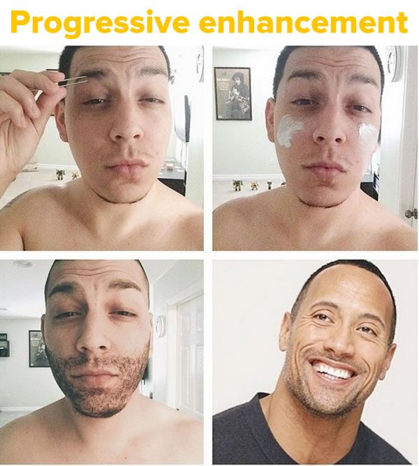
- You should consider progressive enhancement. It progressive enhancement used to be popular, then it fell out of style, and it’s back now.
- Progressive enhancement answers the question “What happens is JavaScript is turned off?”.
- It may sound ridiculous until you consider that JavaScript is effectively turned off for the first 3 or 4 seconds while the page loads; it’s the last thing to happen. This is even more true with lots of people browsing on their phones.
- Your rich web application will stop working if it stop loading because your user has gone to a place where the signal is weak, which happens all the time. This won’t happen to the New York Times because it’s not a rich web app!
- Your site should be able to do something useful even when JavaScript hasn’t loaded. You ecommerce site should still display price and quantity even if the JavaScript for the “add to cart” button didn’t load. Your failure case should still be useful — your pages shouldn’t be all or nothing.
User experience (UX)
- Not what it looks like, but what it feels like, and that’s far more important.
- URLs are part of UX.
- HTTP is a stateless protocol, which is a fancy computer science way of saying “No matter who you pass a URL to, if they follow it, they’ll see the same thing”. If both you and I follow the same URL for a terrible article, we will both see the same terrible article.
- This seems obvious to people who’ve been on the web for a while, but it’s unique to the web, and it’s why the web is so popular. It runs off social networking and our deep-seated desire to share stuff with each other.
- If you’re building a web app, you need to think about how people share it. You can’t have a rich web app that has a single URL that is the home page and a bunch of random shit that happens when you click buttons.
- You should be able to follow a path into a site really deeply, and when you find something and want to share it, you should be able to copy its URL, send it to someone, and they should be able to follow it and see the same thing. That’s how the web is supposed to work.
- Support deep links because the web is social and people share stuff.
- Don’t break URLs! And remember, they’ll end up shared and embedded in everything.
- Your URLs from 10 years ago need to work today, otherwise you’ll lose people who are trying to find you.
- Supporting deep links isn’t just good social networking and SEO; it’s also crucial to scaling.

- Beware Twitter’s hashbang mistake, which they made when they tried to turn it into a rich web app.
- At the time — 2010 — they needed IE6 compatibility, and so they decided to make use of the hashbang.
- The problem with the hashbang is that everything after it in the URL is considered to be a page fragment — it means it doesn’t go to the server; it’s handled on the page.
- This decision means that now and forever, Twitter’s homepage has two jobs:
- It has to be Twitter’s homepage, and
- it has to be the location of any one of 1.8 billion tweets
- If you load Twitter’s homepage from scratch, you’ll see that it stays blank for a second while it tries to determine if you want to see a homepage or a tweet and if it’s a tweet, has to load the user interface and then dig into the database to get that tweet.
- It’s a 2010 engineering decision that broke everything; they’re stuck with a stupid one-second delay forever because they can’t break all those URLs that have been shared.
Solve the users’ problems, not your problems
- A general principle of UX is that you should solve the users’ problems, not your problems; you should be aiming for usability over impressiveness.
- Landing pages, interesting animations, and shadow effects look great the first time, but by the third time, the thing users remember is the slowness of your site.
- Carousels are a really great example of developers solving their problems rather than the users’.
- For some reason, the people who make web sites were under the impression that users would go and click arrows to view the pictures in the carousel.
- See this article from the UX experts, the Nielsen Norman Group, who point out that not only do people not use carousels, they don’t even know what they’re for, they don’t know how they work, they don’t know what the little dots at the bottom are for, and so on.
- “Solving” the users’ problems with carousels by making them autorotate just enrages them, because the thing they were just reading disappears.
- The only reason carousels exist at all is because Apple uses them all the time. Apple can get away with it because they have an entire operating system built around carousels; your web page cannot.
- Carousels are there because they solve an argument in the marketing about which picture to put on the home page: “All three pictures are on the home page! It’s fine!”. That’s not the users’ problem.
Be predictable
- Links should go places. You click them, and you go to another web page, where you can click the back button and return to the previous page, and nothing has changed.
- Buttons should do things. It changes something — it buys something, or deletes something, or kills someone you love.
- You never get angry emails from users saying that you violated their expectations by making a link behave like a button or making a button behave like a link, because most users don’t have a UX vocabulary. Instead, they simply remember that your site behaved annoyingly, leave, and never come back.
- Another way sites behave unpredictably is by using horizontal scrolling. Nobody scrolls horizontally!
- On sites that scroll horizontally, users try in vain to scroll vertically, fail, and leave.
- Remember the principle of spatial memory: our instincts and senses are tuned to the jungle, and thus we have a memory for where things are in space.
- If I’m on a web page and I scroll three feet down the page, I remember that the login button was at the top of the page, three feet up and can find it.
- Developers mess with spatial memory by using JavaScript to make objects on the page shimmer into the background, or float away, or otherwise disappear someplace else, undoing spatial memory, and breaking the sense of where we are on the page.
Be fast
- Performance is invisible UX. It’s an overlooked aspect of UX.
- More than any other thing, the speed at which a page loads determines how good a user feels about it.
- If you have a web page that takes 10 seconds to load because it has a widget, and removing the widget still leaves most of the page useful but cuts the load time down to one second, you should absolutely do that. People like fast pages more than pages widgets on them. This is why Craigslist , with its ugly-ass UI is still popular.
- Fast sites encourage exploration, slow sites encourage abandonment.
Mobile first
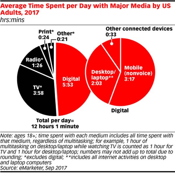
- I’ve said this before, but I need to say it again. About half of the time spent on the web is spent on mobile devices. That’s a fact that hasn’t percolated down to the people who design for the web.
- You have to consider mobile first, and design for the case first. Then you can design for the desktop case. Don’t think about designing for the mobile web as responsibly squeezing things down for a small screen, think about the mobile site as they place they’ll go to first.
- The social nature of the web means that we get links to things when we’re walking around, when we’re using our mobile devices. Before we decide that we’re going to look at something on your desktop, we look at it on our phone, and that’s when your first (and likely only) chance to impress the user.
Accessibility is not an option
- Accessibility is not optional. It’s not a thing you later or a thing you add if you’re rich, or if you’re feeling magnanimous.
- Accessibility means accessible to people who view the web in a way different from you.
- 3.4% of web users have limited vision. If you add in people who have motor control difficulties (for whom very small buttons are difficult to use), and people who have cognitive difficulties, the number of people who view the web differently from you rises to a not-insignificant 8.5%.
- If you’re building an ecommerce site and the question you’re asking is “How do we grow our market by 8.5%?” the answer is to make it simpler.
- The answer to accessibility is to do less! Use built-in controls, because browsers, screen readers, and accessibility devices know what they’re for.
One reply on “Notes from Laurie Voss’ “Stuff everybody knows (except you)” talk from Tampa Bay Startup Week, part 2”
[…] Part 2 […]