Tap the image to see it at full size.
I recently made the mistake of not double-checking my UIs in light mode and dark mode, which left the checklist app in the book I co-wrote unusable in dark mode:
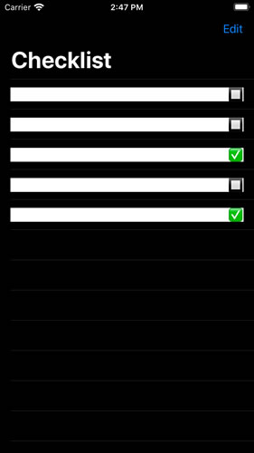
I’d set the text color to the system default text color, which becomes white in dark mode. I also set the background color for rows to white, but forgot to account for dark mode, resulting in this white-text-on-white-background mess. The fix was simple: set the background color of the rows to the system default background color, which adjusts automatically for the current mode.
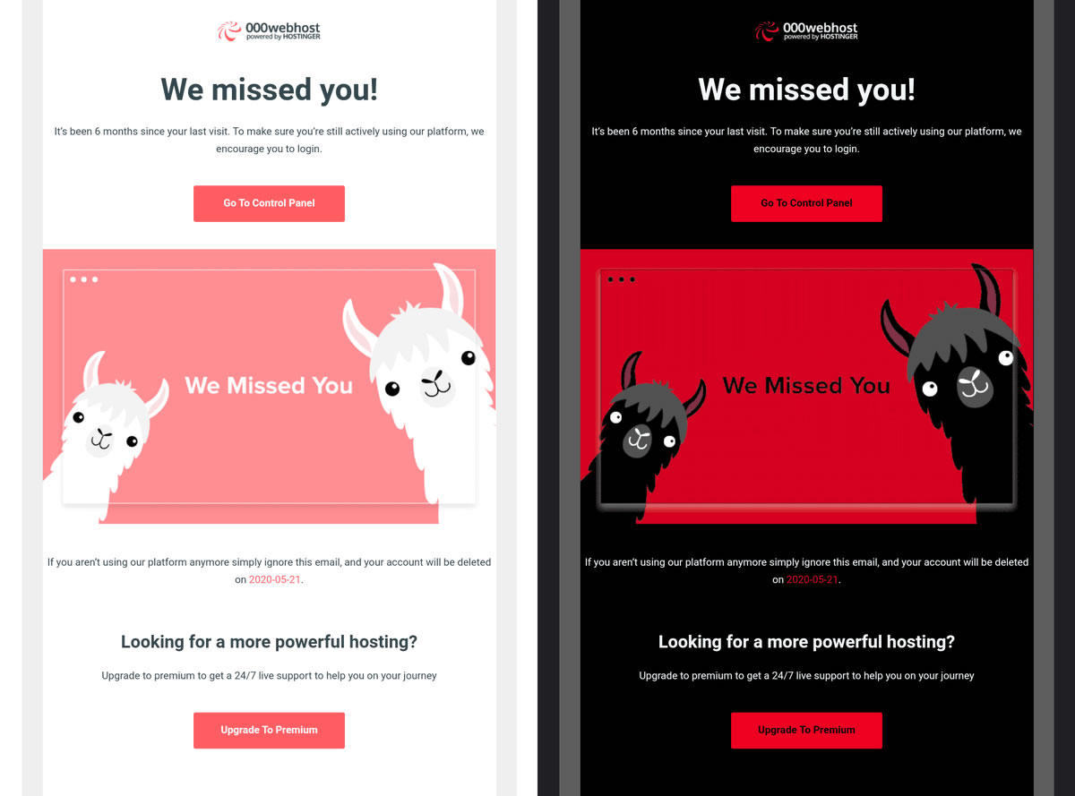
My mistake didn’t produce results as demonically hilarious as the “We missed you!” message from a web hosting service. In light mode, you were greeted by this fluffy llama…

…but dark mode turned the llamas into something completely different (but oh so very METAL):
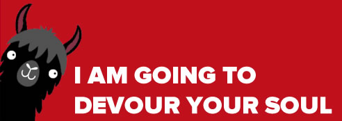
This observation was made by Rémi Parmentier:
Faites confiance au mode sombre de Gmail pour transformer un « Oh ils sont trop mignons les petits lamas » en « OH MON DIEU NOUS SOMMES EN ENFER QU’EST-CE QU’ILS ME VEULENT ». https://t.co/ZVweRiYVe6 (via @Sayo1337) pic.twitter.com/iJ4kwZtt22
— HTeuMeuLeu (@HTeuMeuLeu) May 11, 2020
It translates as: “Trust Gmail’s dark mode of Gmail to transform an ‘Oh, such cute little llamas’ into ‘OH MY GOD WE ARE IN HELL WHAT THEY WANT FROM ME’”.