
I think that we – and by we, I mean we developers and developer evangelist types at Microsoft – get touch and tablets, or slates, or pads, or whatever you’d like to call them, better than the Ars Technica article Ballmer (and Microsoft) still doesn’t get the iPad (written by Peter Bright and posted in the One Microsoft Way section) implies. I believe that over the next few months, you’ll see some interesting touch-related stuff coming from Microsoft, and that we have a responsibility to help developers understand the differences between mouse/keyboard computing and touch computing.
In anticipation of this, I’ve been make my move towards touch- (and other sensor-based) computing over the past little while, by migrating to the following devices:
The idea behind this purposeful move towards touch-equipped devices is to truly understand touch-based interfaces, which UI elements work and which ones don’t, and then to pass the lessons learned to my audience – developers and designers, whether you build for the Microsoft platform or the platforms of the Esteemed Competition.
My own move towards touch-based devices is a microcosmic example of the larger changes taking place at The Empire. The move to touch interfaces is taking place on Microsoft computing platforms of all sizes:

As the Ars Technica article points out, one of the signs that we do get touch is the new interface design of Windows Phone 7. The design philosophy is build around touch (and other sensors), and the WP7 “design bible”, the Windows Phone User Interface Design and Interaction Guide [12 MB PDF], explains this philosophy beyond the mere technical details. Here’s the introduction to its section WP7’s touch interface (any emphasis in the quote below is mine):
Touch input is a core experience of Windows Phone 7 and has inherent differences from traditional keyboard and mouse input systems. Designed for natural and intuitive user interaction, touch input in Windows Phone 7 enables users to interact with application content such as a photo or a web page. Touch input enables simple and consistent user touch gestures that imitate real life behavior, such as panning on a photo to move it. Single-touch gestures make interaction easier with one hand, but multi-touch gestures are also available to provide more advanced gesture functionality.
Application developers should strive to create unique and exciting experiences that encourage the discovery of content through the use of touch gestures. Users should enjoy the experience of navigating through the steps of a task as well as the completion of the task itself. Touch gestures should provide a delightful, more colorful, intuitive experience within applications
Touch delights the senses as the user gets to see the interaction match the performance. The touch UI should always have aware and responsive performance, just like how real world objects respond to touch immediately, and applications on Windows Phone 7 should as well, by performing the action in real time and by providing immediate feedback that an event or process is occurring. Users should not have to wait as it breaks their immersion, flow, and concentration, especially as their gestures transition from one to the other. For example, a pan may turn into a flick or a tap can become a double tap, and the user should not be aware that the UI is switching gesture support.
There’s a great amount of understanding behind the nuances of touch-based interfaces in the Windows Phone User Interface Design and Interaction Guide, and over the next few months, we’ll be covering them in great detail in this blog.

When the Surface, a.k.a. the “Big-Ass Table”, came out, a number of people asked why such a big, expensive thing was built and what practical purpose such a beast would serve.
For starters, there are a number of customers who use it, from casinos in Vegas to bible study classes in megacurches to places closer to home (by which I mean Canada), from the company that did the security for President Obama’s visit to Ottawa to super-sexy Toronto design firm Teehan+Lax to Ontario College of Art and Design to Infusion, who’ve built applications such as Noront Resources’s GSI Surface tool to the security app Falcon Eye.
Equally important are lessons to be learned about input from touch and other sensors from a “concept” machine like the Surface, whose built-in camera systems allow for way more touch points than a resistive or capacitive touch screen will allow, as well as the ability to “see” objects on the tabletop. By being empirical and building such a computer, developing software for it and watching people interact with it, we learn more about touch and sensor-based computing way more than we could from mere theorizing.
I think Des Traynor captured our intent quite nicely in his article about Surface and other Microsoft efforts in the field of user interface:
When the Surface was released two years ago it was chastised by the public. The joke at the time was: “Apple and Microsoft both invest in multi-touch technology, Apple release the iPhone, Microsoft release a $15,000 coffee table!”.
But Surface wasn’t about “re-inventing the coffee table”, so much as it was prototyping a vision of the future of computing. There will come a time when “gathering around a laptop” will seem as ridiculous as connecting an ethernet cable; a time when everyone gathers around a multi-user computer to have a meeting or debate a design. With something like surface, Microsoft are preparing for that day.

A lot of the knowledge from Surface applications have been injected into Windows 7 in the form of the Windows 7 Touch Pack. This pack gives Windows 7 a touch-based API and a set of apps originally designed for the Surface, so that they can run on touch-enabled computers, such as HP’s TouchSmart series, touch-enabled laptops like my own Dell Latitude XT2 as well as any computer connected to one of the new touch-enabled monitors (our manager John Oxley has one in his office).
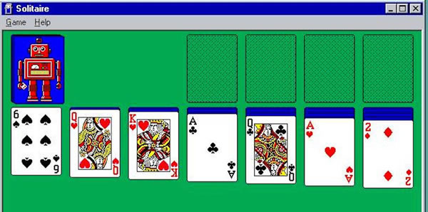
The Ars Technica article goes on and on about Windows 7’s standard interface controls being too tiny for touch, but a quick look at the Touch Pack apps reveals that they don’t use the standard controls; rather, they use controls better-suited to touch. Here’s a screenshot of Surface Collage, the photo-collage application, running on my XT2:

No standard Windows controls here! You manipulate the photos directly using gestures, and the strip along the bottom is a photo list, which you also manipulate through gestures. The closest thing to a standard Windows control is the “close” button near the upper-right hand corner of the screen, which is larger than the typical “close” button – small enough to be out of the way, yet large enough to click with a finger.
Here’s another app from the Touch Pack, Surface Globe, also running on my XT2:

Once again, no standard Windows 7 controls here, but a map that you directly manipulate, augmented by finger-friendly controls.
The Touch Pack apps all follow this philosophy: when going touch, eschew the standard Windows 7 UI controls in favour of touch-friendly ones, and then back to bog-standard Windows 7 when exiting them. These apps show not just that we understand that touch computing is a different beast from mouse-and-keyboard computing, but that we also understand where they intersect.

We’re working on what I like to call “the touch continuum”, which spans pocket devices such as the Zune HD and Windows Phone, to portable computing with netbooks, laptops and soon, tablets, to desktop and tabletop and wall-sized units. And yes, we get that new types of user input call for new user interfaces and give rise to new usage patterns. We’re aware of the challenges of touch (and other sensor) input and over the next little while, you’ll see our answers to those challenges. And better still, we’ll share what we’ve learned in order to make you better developers and designers of software that use these new interfaces.
This article also appears in Canadian Developer Connection.


![intro slide[3]](https://www.globalnerdy.com/wordpress/wp-content/uploads/2010/08/introslide3.jpg "intro slide[3]")


 Me and