Categories
Uncategorized

Pixel Union’s Beautiful Shopify Themes

pixel union - beautiful themes

pixel union“Pixel Union” is synonymous with “beautiful Tumblr themes”. Go take a look at their site and try out the demos of themes like Sticks and Stones with its hand-drawn charm, the retro-urban New Yorker theme or the simple but powerful grid of the Insider theme. Pixel Union themes turn Tumblrs into gorgeous sites that make you want to visit over and over again.

That same gorgeousness that goes into Pixel Union’s Tumblr themes can now go into your Shopify shop. Starting today, you can get your hands on Pixel Union’s new Shopify Themes and turn your shop into a place that customers will want to visit over and over again.

You’ll find the same magic that goes into Pixel Union’s Tumblr themes in their new Shopify themes: Carleton, Jitensha, Technophile and Vintage. They all come with a boatload of features:

  • The same beauty and craftsmanship that goes into Pixel Union’s Tumblr themes, for both your shop’s catalogs as well as its blogs
  • Lots of customizability to make the theme fit your shop: logo, fonts and colors
  • Ties to the big social media services so you can harness word-of-mouth for your shop
  • MailChimp integration so it’s simple to set up an email newsletter campaign to reach out to your customers
  • Pixel Union’s speedy, expert and personalized support

Here’s a closer look at Pixel Union’s Shopify themes…

Carleton Classic and Modern

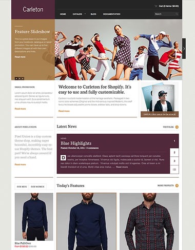
The Carleton theme is reminiscent of those thick, high-end clothing catalogs and comes packaged with two similar but distinct “flavors”. First, there’s the traditional, clean Classic:

carleton classic theme

Carleton Classic: See its page in the Shopify Theme Store | View the demo

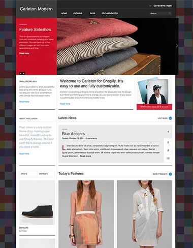
…and there’s the contemporary, bold Modern:

carleton modern theme

Carleton Modern: See its page in the Shopify Theme Store | View the demo

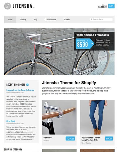
Jitensha

Jitensha takes its inspiration from Japanese culture: the word means “bicycle” in Japanese, and the theme takes its design cues from Japanese minimalism.

jitensha theme

Jitensha: See its page in the Shopify Theme Store | View the demo

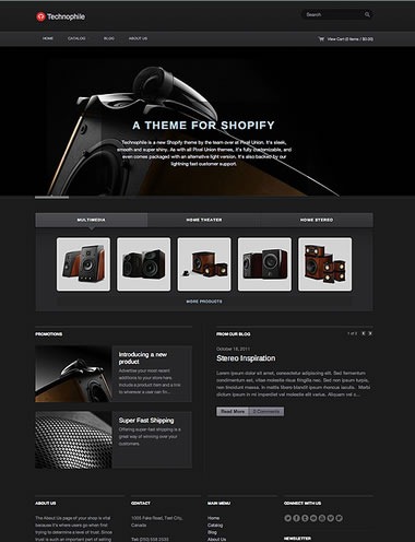
Technophile Dark and Light

If your shop is about gadgets and gear, you should check out Technophile. It pays homage to Apple’s legendary interface design and comes packaged with two styles. There’s Dark

technophile dark theme

Technophile Dark: See its page in the Shopify Theme Store | View the demo

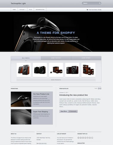
…and if you prefer the white iPhone, there’s the Light style:

technophile light theme

Technophile Light: See its page in the Shopify Theme Store | View the demo

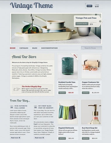
Vintage Theme

If you have a shop that specializes in hand-made, artisanal products, you should check out Vintage Theme, with its letterpress-on-high-grade-paper look and boutique “feel”.

vintage theme

Vintage: See its page in the Shopify Theme store | View the demo

See Pixel Union’s Themes and More at the Theme Store!

theme store pixel union

Shopify gives you lots of options. If you’ve got the time and know-how, you can create a theme that’s your very own. You can also find the right “look and feel” your shop with a free or paid theme at the Theme Store, whether it’s one created by Pixel Union or any other of the wide range created by shopowners and designers.

We’re very happy to welcome Pixel Union to the Theme Store, and we think you’ll love their themes!
This article also appears in the Shopify Blog.

Categories
Uncategorized

Future Visions

Welcome Daring Fireball readers! In case you were wondering if I’ve prepared a response to the article titled The Types of Companies that Publish Future Concept Videos, take a look here.

Pictured above is Microsoft’s most recent technology concept video. Here’s their description:

Watch how future technology will help people make better use of their time, focus their attention, and strengthen relationships while getting things done at work, home, and on the go.

As you might expect, John “Daring Fireball” Gruber, who’s often been called Apple’s freelance PR guy, viewed it with a jaundiced eye:

This video encapsulates everything wrong with Microsoft. Their coolest products are imaginary futuristic bullshit. Guess what, we’ve all seen Minority Report already. Imagine if they instead spent the effort that went into this movie on making something, you know, real, that you could actually go out and buy and use today.

Of course, he’d never say such a thing about Apple’s classic Knowledge Navigator video, which at the time it was made – circa 1987, when the Macintosh II and SE, IBM PS/2 series and Amiga 500 and 2000 were brand new machines – was at least as pie-in-the-sky as this newest Microsoft video. It’s contained within one of the segments of the video below, which features videos by Apple:

Now I’ll agree with Gruber that by and large, Apple technology is generally more enjoyable to use and feels more like “the future”. I will also agree that my former employer, whom a former coworker recently referred to as “The Fail Ship Microsoft”, seems a shadow of its former self and far less likely to be the company to create future industry-defining products than Apple — or at least the incarnation of Apple with Steve Jobs as Chief Tastemaker. Today’s Microsoft doesn’t have a keeper of the vision: Bill Gates has left to focus his on saving the world, Ray Ozzie, the guy who took on the role of “chief visionary” at The Empire, resigned last year along with the Entertainment and Devices division’s last, best hopes, Robbie Bach and J Allard. The people who remain are extremely skilled techies, astute suits who can continue to drive sales and “keep their managers’ scorecards green” (that’s a common expression within the company) and an evangelism team that’s second to none and of which I was a proud member, but they’re all hamstrung by decision-makers with the sense of vision that God gave oysters. That’s one of the reasons I left the company: to be an evangelist, you have to believe, and I didn’t believe anymore.

I part ways with Gruber in his declaration that Microsoft should spend more effort making some cool stuff today and less on creating concept videos. Concept videos aren’t promises of products coming in the next one or two years, but act as a star by which people can navigate the future and an inspiration to invent it. Working with technology means dealing with overwhelming amounts of minutiae, and it’s all too easy to get lost in the technology for technology’s sake and forget about what it’s all for. I would argue that if Microsoft wants to rehabilitate its image and regain its relevance in the hearts and mind of both the alpha geeks and the public at large, they should probably make more of these videos, not only for the public, but for their own benefit as well. Without visions like concept videos to guide them, especially with the lack of someone in the visionary role, they may remain stuck on their current course: doing well but effectively coasting, content to make incremental improvements to already successful products or playing catch-up as with Internet Explorer, phones and tablets in efforts that are in danger of being too little, too late.

Some other concept videos worth watching include these old AT&T ads from that played all the time between shows in the early 1990s. Many of the predicted devices and services in these ads came to be, but AT&T had little to do with their creation:

Bruce “Tog” Tognazzini was a user interface guy at Apple from 1978 to 1992, after which he worked at Sun and created the Project Starfire concept video, a little drama that illustrates his vision of the office of the future. Just as Apple’s Knowledge Navigator has the 1980s all over it, this video has all the earmarks of early 1990s television, right down to the incidental synth music that’s straight out of the better, earlier seasons of Beverley Hills 90210.

Here’s part one:

The first thirty seconds of the video shows how risky it is to try and add little “realistic” touches to a story about the future. In the first thirty seconds, Princess Di is mentioned as having joined the British House of Lords; in real life, she died seven years prior to the story’s setting of 2004. Also sad is the fact that while Sun existed in 2004, it would be absorbed by Oracle six years later.

Here’s part two:

Compare the Starfire video with this “vision of the future” video that Microsoft debuted at the TechReady conference in early 2009. Popular Science said that "The 2019 Microsoft details with this video is almost identical to the 2004 predicted in this video produced by Sun Microsystems in 1992." I’ll leave it to you to make the call:

This article also appears in the Shopify Technology Blog.

Categories
Uncategorized

The New Windows Phone 7 Ads and a Big Hint for Your App Designs

The Ads

Rather than tell you how great-looking and clever the new ads for Windows Phone 7 are, I thought I’d show them instead. Here’s the first one, which features Donovan’s song, Season of the Witch:

Here’s the other one, which asks this question: “Really?” (In case you were wondering, the tune is In the Hall of the Mountain King by Edvard Grieg.)

The Hint

Clock

The message in both these ads is pretty simple: Smartphones eat up a lot of your attention and time. Wouldn’t it be nice if there was one that didn’t do that?

There are lots of little goodies in Windows Phone 7 that address this issue. The ones I can think of off the top of my head include:

  • The lock screen. You don’t have to unlock your phone just to find out what the next appointment on your calendar is. The lock screen displays it, along with the date, time and the number of voice and text messages you have.
  • The Start page. The start page is where you pin your favourite and often-used items so you can access them quickly, so you don’t have to riffle through page after page of apps.
  • What you can pin to the Start page. You can pin more than just apps to the Start page. Is there someone – a spouse, significant other, friend or family member – whom you phone, text, or email often? Pin that person to the Start page! Is there a website you hit many times a day? Pin it to the Start page!
  • Communicating quickly with people. The People Hub on your phone makes looking up and reaching people fast and easy. Tap on a person for all the ways to reach him or her and tap on any of one of those ways to start communicating. A quick swipe shows you that person’s Facebook updates. Getting in touch and keeping up is pretty easy with this UI.
  • Finding. The context-sensitive Search button is all about finding what you need, whether it’s some information on your phone, on the web or in the real world, and you get this all from a single button press.

In all these cases, it’s about getting what you need from the phone, as quickly as possible.You should ideally be able to “glance and go”: fire up your phone, get the information you need, then put it away and go do what you set out to do. The phone is supposed to augment your life; it’s not supposed to be your life.

And therein lies the hint for your app designs. If you’re designing an informational, non-game app for Windows Phone 7, take a cue from its “glance and go” philosophy and ask yourself this: What one question does my app answer for the user, and does it answer this question quickly?

Examples of questions that apps can answer include:

  • Where’s the nearest Tim Hortons?
  • Should I take an umbrella with me today?
  • Am I getting a good deal from this store, or should I be shopping elsewhere?
  • Given a choice of three different wines, which one should I buy?
  • What interesting stuff is happening in this city tonight?

If you’re thinking of building a WP7 app, think of a question it can answer for the user, provide the answer and then get out of the way. Let that be your guide and you just might code up a winner.

This article also appears in Canadian Developer Connection.

Categories
Uncategorized

THIS is How You Do It: The USGA Golf Score App for Windows Phone 7

intro slide[3]

One of the tricky things about helping developers build for a platform that has yet to be released is that it’s a tabula rasa. There’s no history, which is both blessing and curse: we developers get to make that history, but at the same time, we’re working in the dark. There are no examples to emulate and no best practices to follow – it’s just us and whatever user interface guidelines there happen to be (which, in the case of Windows Phone 7, is the Windows Phone UI Design and Interaction Guide).

That’s why I’m glad that Microsoft is building WP7 apps like USGA Shot Tracker, a gorgeous golf scorekeeping app that practically announces to developers: “This is how you do it. This is how you write a usable, beautiful, truly Windows Phone 7 app.” Here’s a video of USGA Shot Tracker in action:

Give the app a look, and also make sure you check out the article on Long Zheng’s blog, istartedsomething, which includes images of USGA Shot Tracker’s screens.

Keep an eye on this blog, because I’m a couple of days away from starting an ongoing series on well-designed WP7 apps and how you implement them. I’ll take a closer look at USGA Shot Tracker and other apps, going through them with a fine-toothed comb in attempt to learn as much as possible from them, and share that knowledge with you.

This article also appears in Canadian Developer Connection.

Categories
Uncategorized

Perspectives on Clojure and F#

Get Microsoft Silverlight

Don’t have Silverlight? You can download it here or download the video in MP4, MP3, WMA, WMV, WMV (High) and Zune formats.

Here’s a Channel 9 video shot at Emerging Languages Camp 2010, the first conference on up-and-coming programming languages held in Portland on July 21 – 22. It’s a casual conversation with:

  • Rich Hickey, creator of the Clojure (pronounced “closure”) programming language. It’s a dialect of Lisp intended general-purpose functional programming language with a lot of support for concurrent programming. If you caught our Ignite Your Coding webcast with Robert C. “Uncle Bob” Martin earlier this year, you heard his high praise for the language. Clojure targets both the JVM and CLR.
  • Joe Pamer, compiler developer for the F# programming language. F# is a “hybrid” programming language, built with functional programming in mind, but also programmable in a more imperative object-oriented way. Much of it is compatible with the OCaml programming language, there are some C# ideas in there as well, and it’s one of the languages baked right into Visual Studio 2010.

In this conversation, Rich and Joe talk about their ideas on programming language design and evolution, functional programming, concurrency, how F# fits into Visual Studio and the granddaddy of them all, Lisp.

This article also appears in Canadian Developer Connection.

Categories
Uncategorized

Ten Things You Need to Know About Design

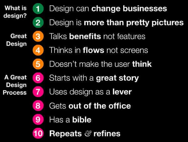
10 things about design

What you see above is a slide from Jason Putorti’s slide deck titled 10 Things CEOs Need to Know About Design. Don’t let the title throw you off: everything in the presentation is even more important for developers because we actually make the things our customers use.

If you decide to commit only one of these ten things to memory, commit this one: Design is more than pretty pictures. It’s about combining different aspects of intelligence – rationality, creativity and empathy – to meet your users’ needs and drive business success. It’s about crafting the user experience, which is how the thing you’re designing works in the real world and how your users feel about it.

I’ve included the slide deck below…enjoy!

This article also appears in Canadian Developer Connection.

Categories
Uncategorized

“I’m Comic Sans, Asshole!”

"I'm Comic Sans, Asshole" -- John Marston from Red Dead Redemption pointing a gun

That most hated of typefaces, Comic Sans, gets anthropomorphized and bad-assified in Mike Lacher’s piece for McSweeney’s titled, (in)appropriately enough, I’m Comic Sans, Asshole.

This article also appears in The Adventures of Accordion Guy in the 21st Century.